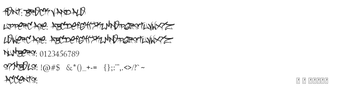
Brock Vandalo, by Brock Vandalo, is a graffiti-inspired typeface that converts hand-tagged lettering into usable design assets. The font recreates spray-painted strokes with hand-drawn letterforms and an energetic, high-contrast display aesthetic. Its visual approach draws on pixação influences and irregular stroke endings to produce an urban voice. Graphic designers, urban artists, and content creators who need a street-style headline face for posters, branding, or apparel will find its raw character useful.
What does the font contribute to urban typography?
The font replicates spray-tag geometry by using uneven stroke widths and abrupt terminals that emulate spray-painted tags. Its letterforms are deliberately irregular, so text reads as an expressive display face rather than a neutral body type. The design emphasizes single-word treatments and short phrases, where the raw, hand-drawn shapes convey an underground aesthetic without additional graphic effects.
How much typographic control does it give designers?
The typeface supplies an extended character set that broadens layout options: it includes accented Latin letters, numerals, and punctuation drawn in the same stylized voice. Because the glyphs are hand-crafted, designers should plan for manual spacing and scale adjustments when composing headlines. Use of tracking, kerning pairs, or outlined shapes is a practical way to refine alignment for large-format prints or apparel transfers.
Is it straightforward to install and integrate into workflows?
The font is distributed as a TrueType (.ttf) file, compatible with most desktop design software and word processors. Installation on Windows is a simple right-click on the .ttf and selecting Install, and the file also works on macOS and Linux systems that accept TTF fonts. Designers can drop the file into shared asset folders or font managers for project-wide access.
Vandalo suits headline-focused designers seeking an urban voice
Vandalo is a well-suited option for designers who want an authentic graffiti-derived headline face that reads strongly at display sizes. It is less suitable for running text because the aggressive, irregular letterforms reduce legibility at small sizes. Tip: pair the font with a neutral sans for body copy and reserve Vandalo for titles, logos, and graphic treatments.
Pros
Hand-drawn letterforms that mimic spray-painted tags
TrueType (.ttf) format, compatible with common design software
236 glyphs expand punctuation and accented character coverage
High-contrast display styling emphasizes headlines and logos
Cons
Aggressive letterforms reduce legibility at small sizes
Irregular spacing often requires manual kerning or tracking
Distinct pixação influence limits neutral or corporate applications
Laws concerning the use of this software vary from country to country. We do not encourage or condone the use of this program if it is in violation of these laws. Softonic may receive a referral fee if you click or buy any of the products featured here.